Revamping a Home page for an E-commerce site and creating a responsive Desktop design
**Before i dive in, i just want to state, the reason for this project was purely to create a responsive design for my site, as i had noticed that the layout of my site was perfect for Mobile and Tablet users, but not soo much Desktop. The designs for the site have been inspired around my new label for my product. Nothing has been finalised YET! for the site. These ideas are creative outbursts ive had while trying to come up with a compete design that customers will be happy navigating... But anyhoo i hope you enjoy my random thought processes nonetheless.
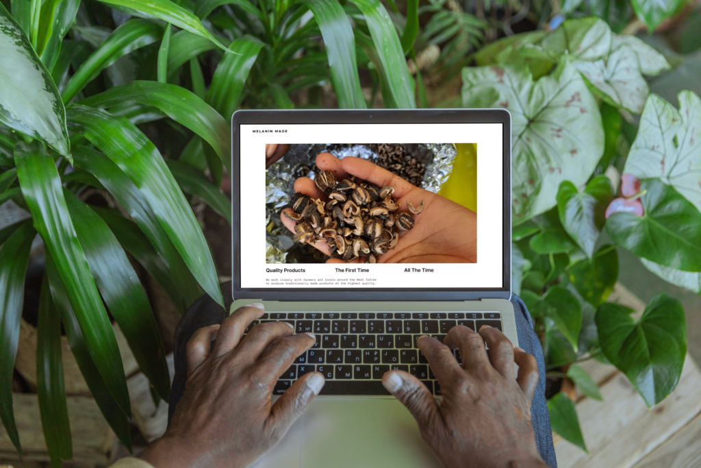
Desktop view
Tablet view
Melanin Made is a personal brand of mine, that i have been building since 2017 by myself, i originally started the brand selling to a small set of people on Instagram, with little to no knowledge of branding, marketing or even running a business to be fair. My business came about purely because i was sharing on social media the benefits and transformation my product was doing to my daughters hair and from there thats were the brand took off.
People wanted the product and i had no time to really think about the branding or how things should come about, i was literally thrown in the deep end. Below i will show images and videos of where the brand began and the plans i have for it now, further down you will be able to see the development of the brand and the brief steps i took to take it were it is now. HOWEVER, there is a lot more me to do and achieve before i am completely satisfied with the whole vision for the brand.
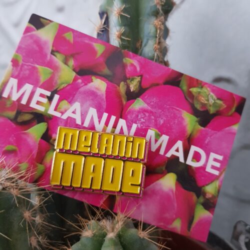
Product branding
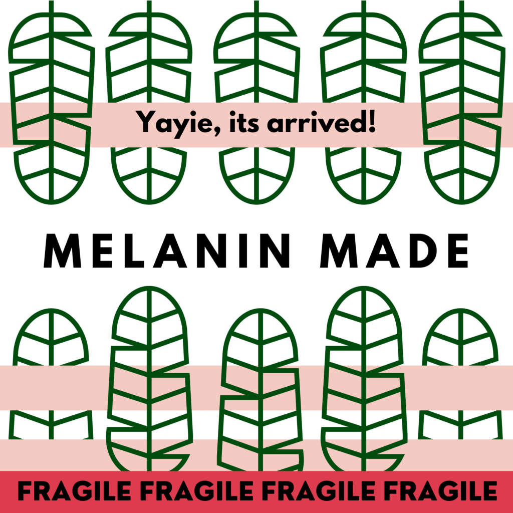
Original "label"
This was the original label for my product, lol. As you can see there was really nothing to it, no brand identity and know written information to show customers how the product could be used.
As my product became to be in more high demand across social media. I had one choice and that was to update the label, so that it at least “looked” like an actual product, that could be put onto the shelves or in someones vanity.
My goal for the brand was to reach different types of audiences, customers and then eventually step into trade shows. And although my followers (customers) on social media didn’t “mind” the lack of branding, as they had been following my journey for quite some time. Ideally, it wouldn’t make sense to other customers, who wasn’t aware of Melanin Made, to have a product without the correct details on the label.
My priority for this was 1st to get the label done to a satisfactory stadard… one that i could possibly do myself.
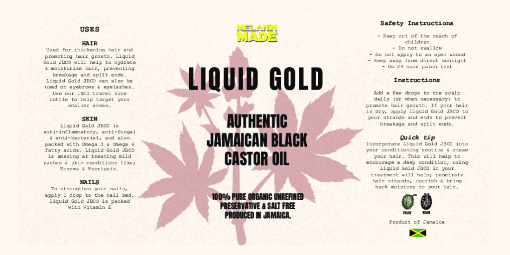
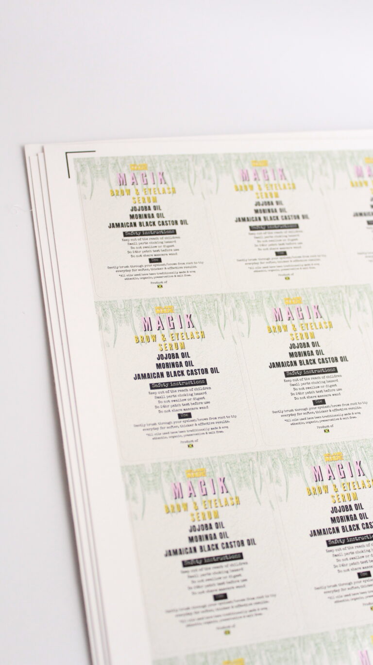
This label here, i absolutely loved. Although i had zero knowledge about how to create and design a label. What was important for me, was to get the message across to my customers, the key points and factors of my product. the priorities were:
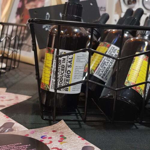
what the product is (Jamaican black castor oil)
risk factors/ safety instructions
uses
instructions
Upon doing research, it was clear to me that these pieces of information were the priority for customers, ultimately, this would give new customers ( who are not familiar with my journey) a good idea, if they wanted the product or not. Compared to my original label, which only had the brand name on it.
The downside however, to this label, was that it was hard to read, as some text was not eye adjacent and made it hard for customers to read easily
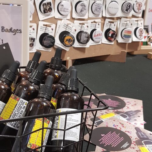
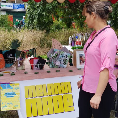
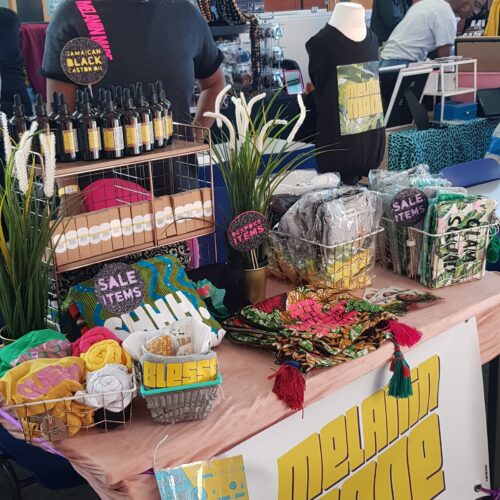
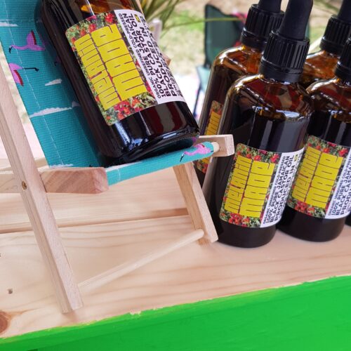
Trade shows and brand awareness
Collaborating to decide a new label design
Collaborating to come up with a new label design
A Facetime call was done with my friend who helped to redesign my label, I gave her a link with my Pinterest ideas and she came up with beautiful mockups for the labels.
Design development
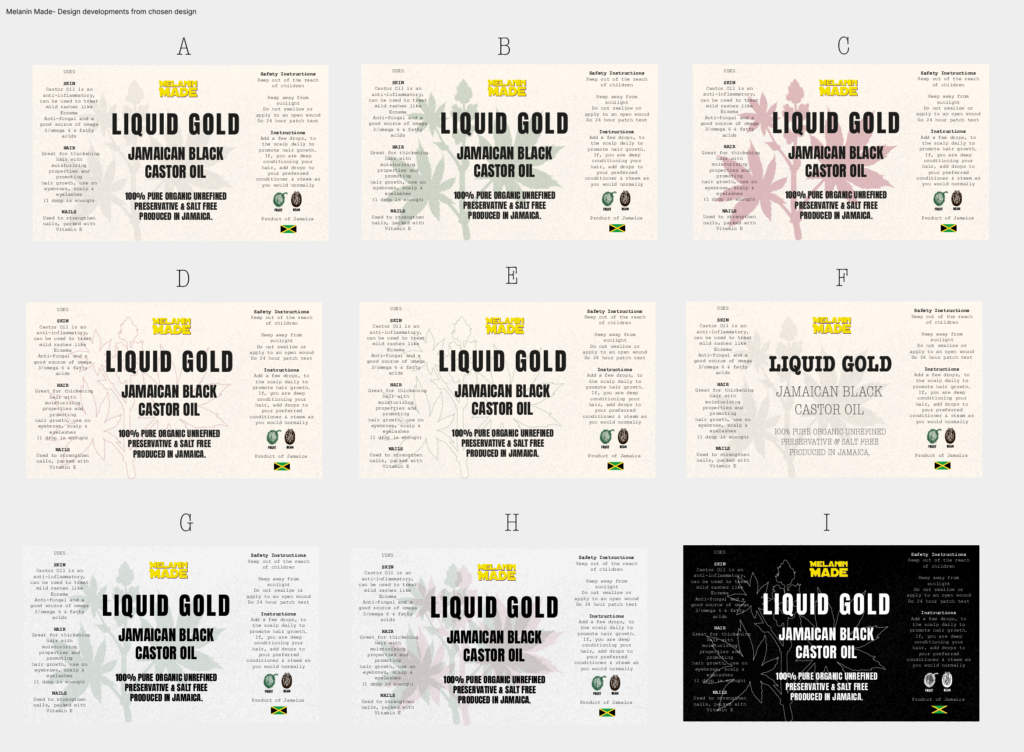
Chosen design
After a few hours of deciding on the label, we picked one and came up with a few design developments.
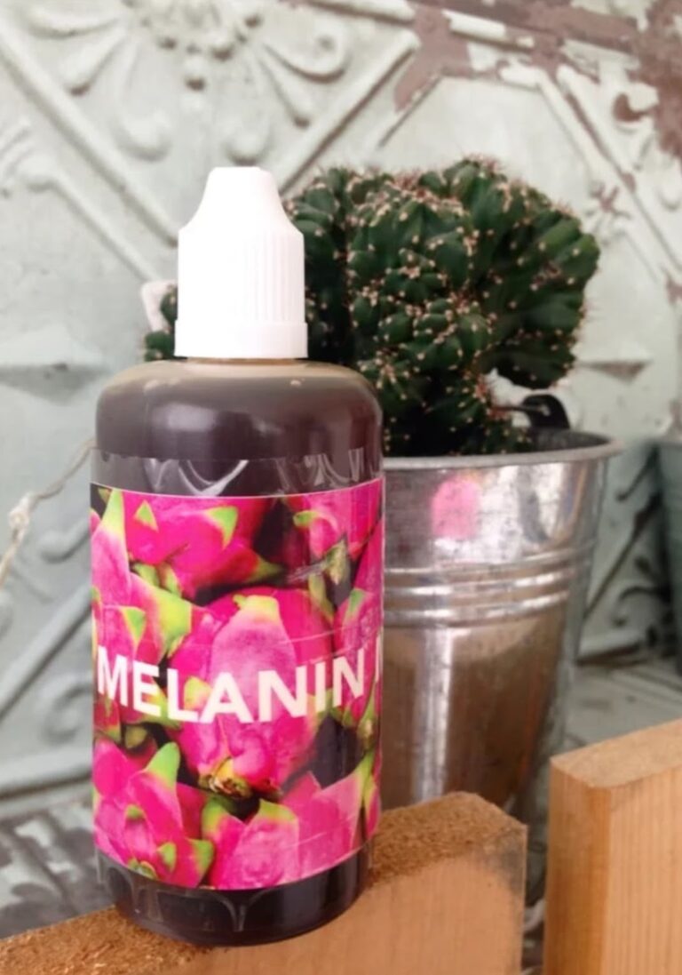
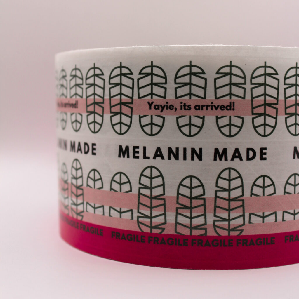
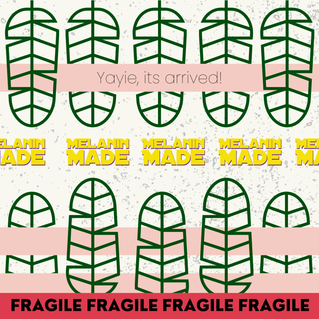
Final product design
The purpose of this video was to show customers the new label, as well as showing them that the new labels are now water (and oil) proof. As the previous labels before were not, which resulted in oil stains and a unflattering look.
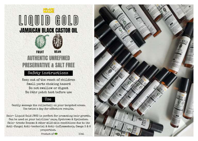
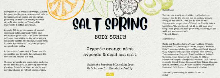
Creating a smaller label for smaller bottles
Design made on Canva
Creating a design that matched the new label took a bit of time for me, just due to the fact that, there was a lot of important information that needed to be on such a small bottle. The information needed to be clear, informative and also legible to my customers. Once i was able to get the overall layout that i needed, i then went on to match the aesthetics of the new label. While also giving the smaller label its own unique identity.
Playing about with layouts
Another iteration
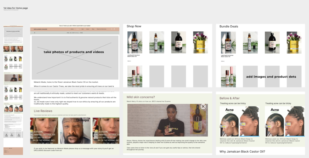
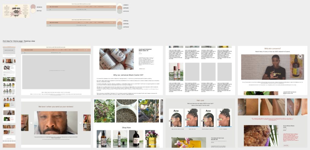
For the 2nd design, i really took inspirations from the likes of some of my favourite beauty brands. I noted down, what was a priority for the customer to see, if they were to land and scroll down the site. What could they connect and relate to, And what would give them easy access to “add to cart/buy” without really leaving the home page.
I also drew similarities from the brands new label by including the same colour schemes and keeping in tune with the brands theme and identity.
The previous design above, was really centred towards Before and Afters, customer reviews and feedback. After some thought and taking a step back, it dawned on me that the new site design would come across pushy and heavily marketed to try and get the customer to buy.
With this new design, i wanted to reflect more on the products itself, showing the benefits, the history as well as implementing drips of customer imagery onto the page also.
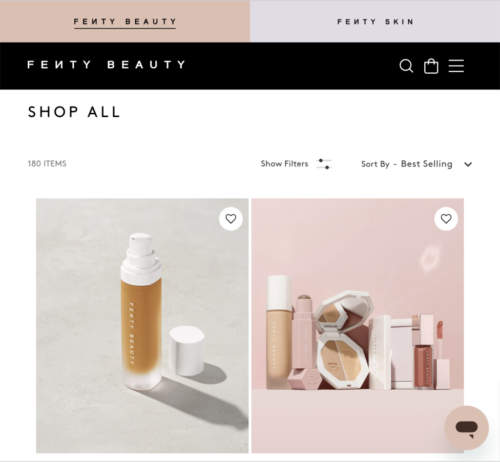
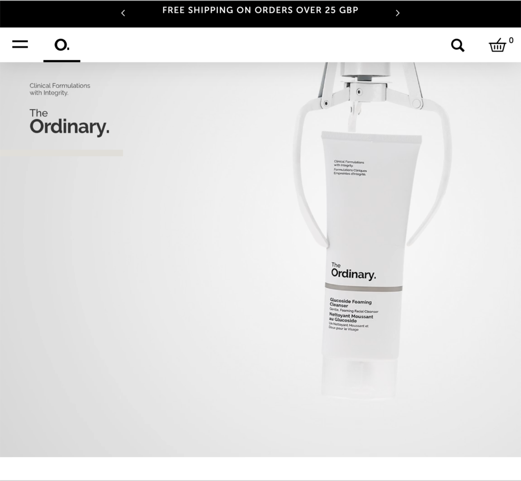
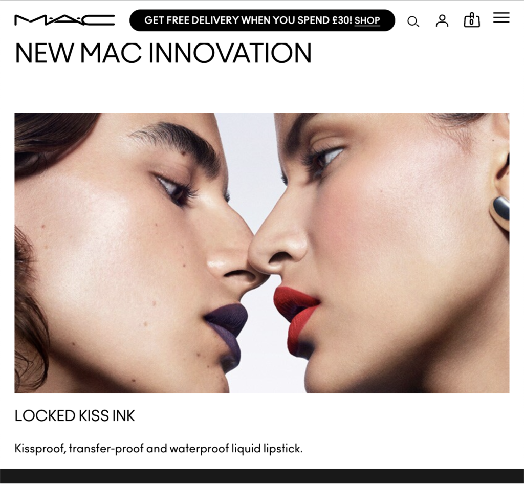
Beauty brands i took inspiration from
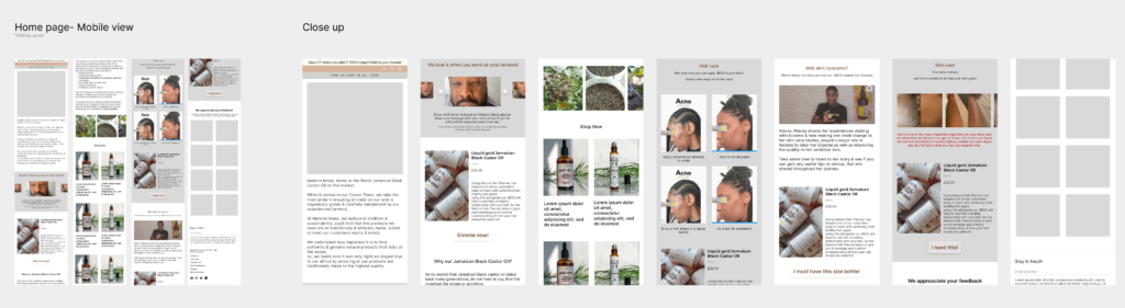
Responsive design for a smaller screen
Once certain placements were in place for the desktop design, i decided to then focus my attention in creating a design for smaller screens. To make sure that when i send my final designs to the developers, there is a clear distinction between how it should look. As i had initially mentioned earlier, the whole reasoning for designing a new complete website, was simply because my current site, just wasn’t responsive or appealing at all for desktop users
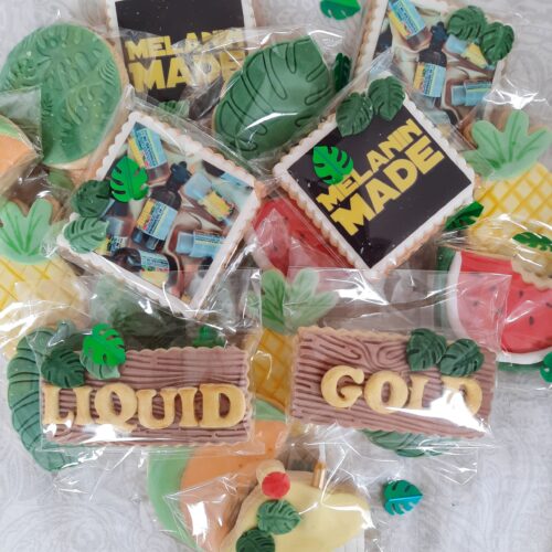
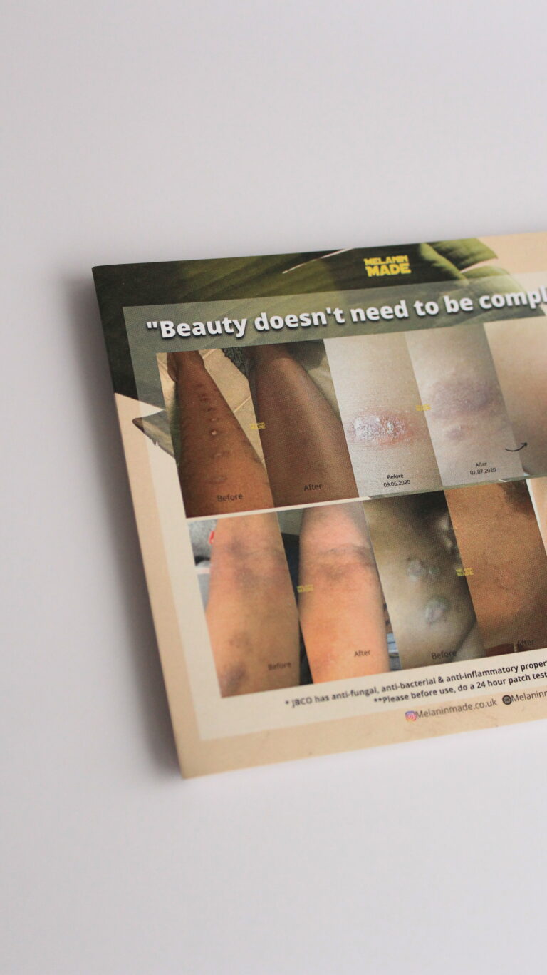
Flyer designs
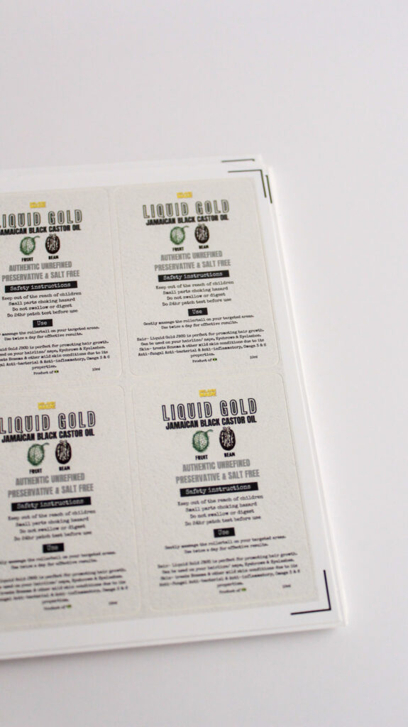
Other label designs
Branding-
Moving forward
Going forward, the plan is to iterate on my designs, layouts, product photography and typography for the site. Once that is done, i then plan on passing my designs over to developers to get the ball rolling.
As said up above, there is still A LOT that needs upgrading in regards to the brands identity. As this is my own brand, i recognise that consistent changes will be an on going factor for Melanin Made.