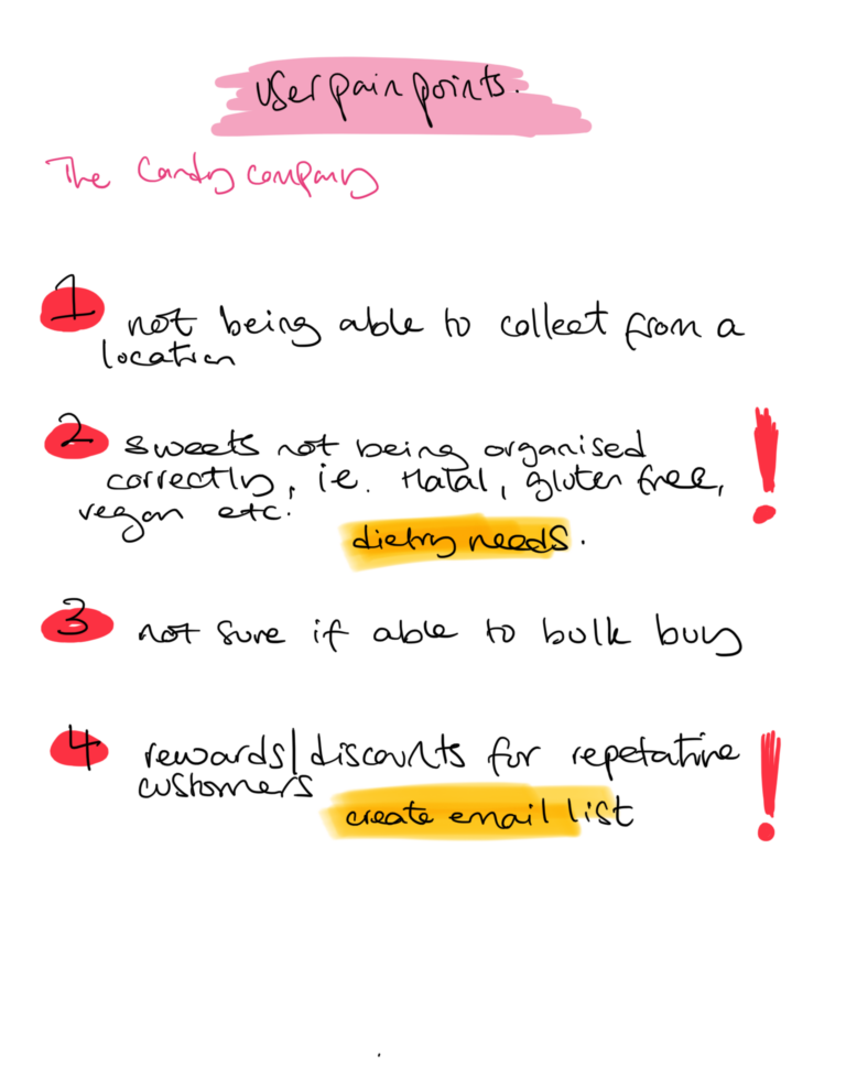
The Candy Company

Designing a dedicated app

Exciting times,

(Website example below, is owners)

The Candy Company is a small business, Owned by Cerez, who by trade is a qualified Teacher and a busy Mum of 3. I began to socialise with her through social media, sharing and connecting stories about our children. Then after a while became really good associates, supporting each other with our endeavour’s, as well as, supporting her brand for many years. Ordering sweets in bulk for friends birthdays, baby showers and even making orders to treat my children from time to time.

As i was a frequent customer, i have always been familiar with her web app and thought it was pretty easy to use and navigate. But after one of our many discussions with her about the companies new direction with the site, i had asked if she ever thought about creating a dedicated Mobile app for her store, as she was made aware before, that the majority of her customers shopped from their phones.

Initially, Cerez told me “no”, but thought it would be a good start try something new with the brand. It was decided that i start to do intensive research to really dig deep into what users wanted to see from the brand, i had looked at her current site and picked an element i believed would be important to the user and from there i started concentrating on; personas, pain points, competitive audits and usabilty studies. From there i was able to design a flow that was simple for even the busiest of users.

User pain points

I had asked Cerez (the owner) if she could send out a brief email to her customers; asking them if they could do a brief survey on what they would like to see from the brand and what there frustrations were. These were the mains points that came back from 74 of her customers/clients. I took these findings and listed them based on priority, using an exclamation mark to enthesise the importance of the pain points.

Imagination time!

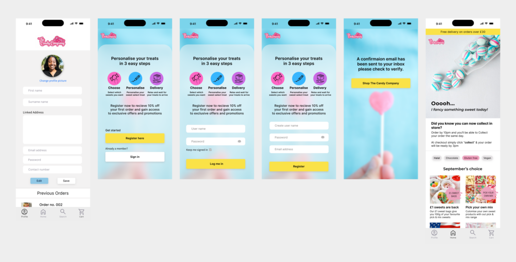
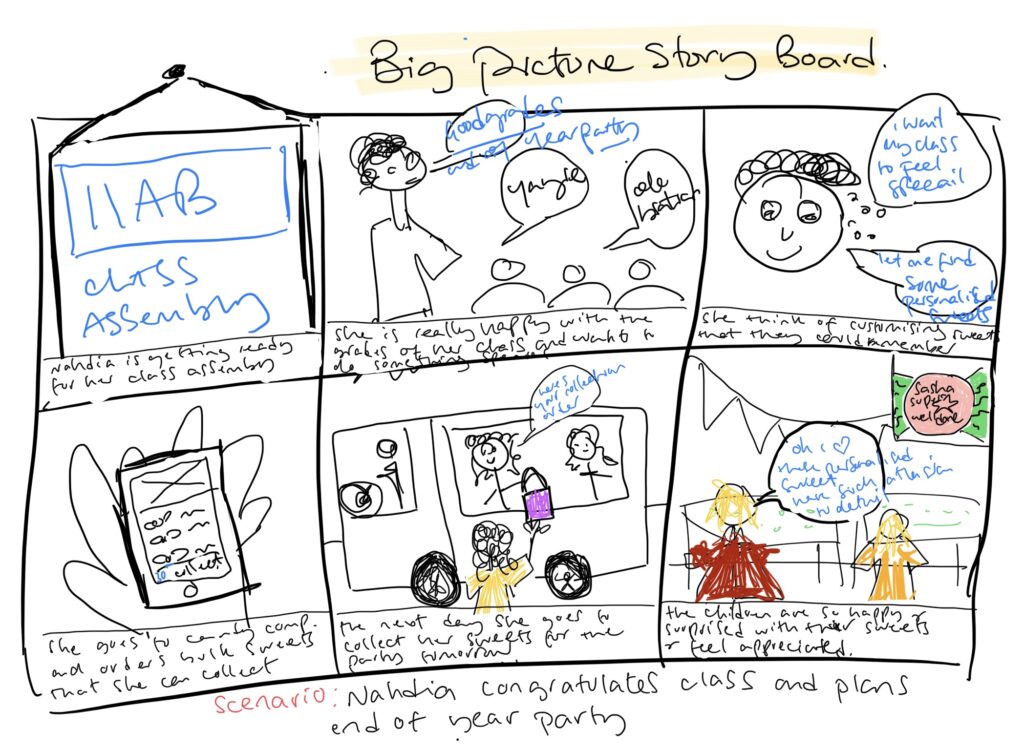
I thought it was necessary to create a user story to help with the design process. As this is something i do, when i design clothes (for me this makes empathising with the user a lot easier, as i'm visually able to see the "customers concerns". Our pretend user “Nahdia’s prepping for her classes end of year party and wants her students to feel appreciated for their good grades. She’s quite stressed as she feels as though she won't be able to meet the required dietary needs for her students and needs to find a company who can accommodate a large order.”.
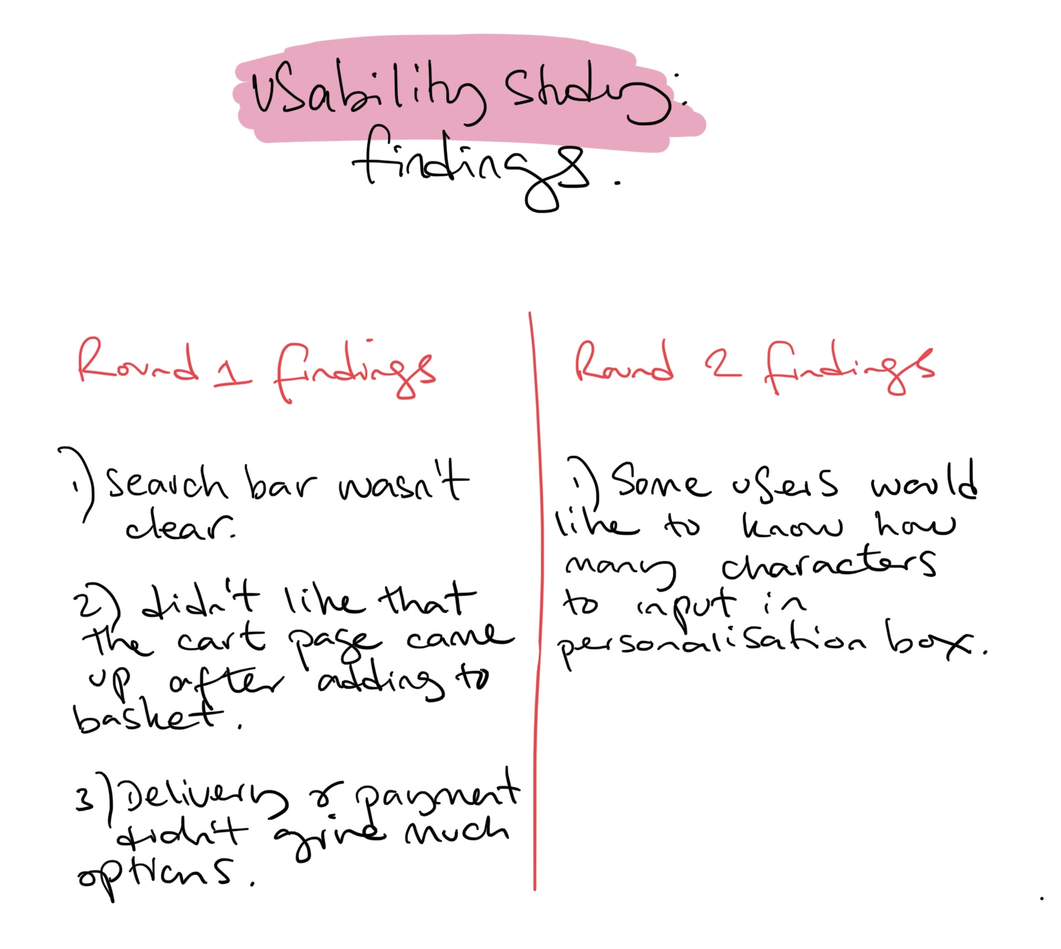
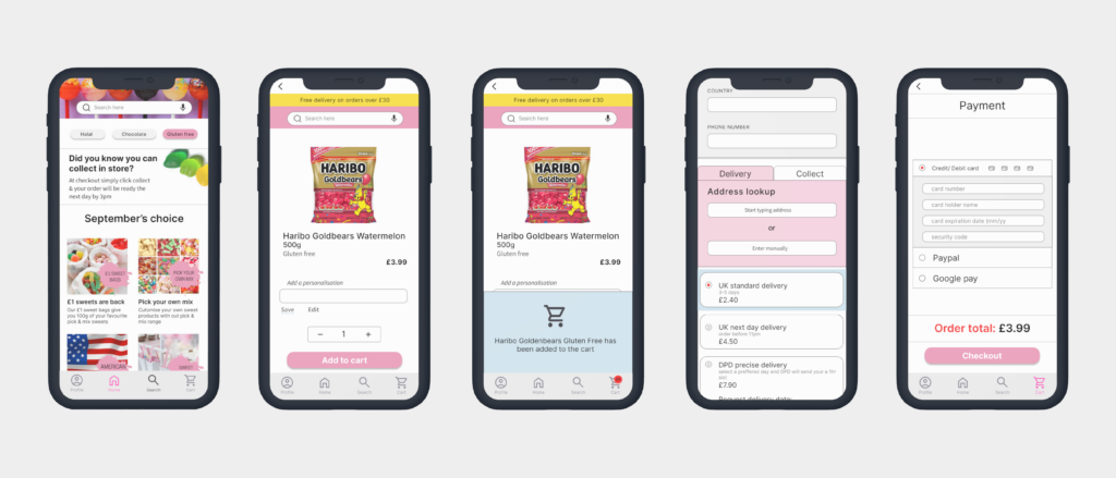
Competitive audits

I conducted a competitive audit to see how other brands, that were similar and shared the same products structured their site and apps, all of the research done was secondary as i had to look at the design of the interface as see what they thought was important for the user. I discovered that, the brands who were similar to The Candy Company, their sites all had a similar structure.

As these brands, sold the same products, i thought it was best to design an app for The Candy Company that also felt similar to the user and not design an interface too left field.

Story boards

The design & of course

For my 1st sketch of the paper wireframes i can admit, i wasn’t sure i was making the right decisions as this was all so new to me. However, i wanted to ensure, the home page at least had a filtered section & search page, where users could easily find products. I wanted product images to be visually clear and the design had to be free from clutter so that it felt easy to navigate around.

The next step was creating the low fidelity wireframes & prototype, that i could test out to a few number of people to use. My goal for the user, was to have the ability to access or scan for treats quickly and not feel too overwhelmed with finding a particular sweet, especially as The Candy Company stocks a wide range of sweets.

My thought process for the designs where:

  • Having a pre-filtered selection on the home page that was accessible for the user.
  • Making the search bar prominent so the user could type in a product
  • Showing a range of popular sweets that the user may take interest in.
Prototype and Moderated studies

The scripted moderated study was done with 5 participants for The Candy Company app. I found that the participants were struggling with certain navigation issues, i grouped all the issues together and found 3 dominant themes from our testers that kept arising

Ooooh the parts.

Usability findings

The feedback and findings, taken from the moderated study were brought to the Owner of The Candy Company, we sat and discussed what our users thought of the feedback that was given to me. Once we agreed on a new design with the findings given we agreed to move forward with the high fidelity prototype.

Round 1 findings (iterations)

The high fidelity wireframes were amended to meet the users concerns that were raised. Myself and the owner decided to do another test study with 5 participants, this time unmoderated, as most of the participants chosen to take part on this occasion decided they wanted to conduct the study from the comfort of there home.

Participants were overall happy with how the app flowed. However, some users suggested that there should be information to show the amount of characters the “add personalisation” field could hold. From the insights this was the only priority that needed to change.

My personal findings
  1. I considered having the ability to be able to search across the screen a high priority for users. As this is a candy shop with alot of products i wanted users to feel that they could access the search icon from anywhere on the screen without feeling like searching for something had to be done from 1 page
  2. Adding a notification that alerted users when something was added to a basket was key. It allows users to feel as though an an action has happened, so that it doesn’t leave them feeling lost or confused
  3. Creating 2 pages that has the ability for users to select a delivery or collection method was key. The delivery options gives multiple choices for the users to pick the best way to receive their item, whereas the collection method showcases locations they can collect from
Round 2 findings (iterations)
The impact

I wanted the design of the app to feel seamless, without any interruptions or fuss. I wanted to stick to the brands theme of pastel colours but not making it feel overwhelming to the user. I really wanted to listen the the users and owners feedback to get a clear understanding of their pain points, what they wanted to see and experience from the app.

After the 3rd unmoderated study i did with another 5 participants, there was only one reoccurring theme that came back – which was highlighting how many characters a user should input into the field, as there was no more user concerns that came back, i decided to to step back from the design to see what other further changes i could make, and to be honest… even though i was happy with the overall design and usability of the app, i just felt like something was missing. Especially in the “payment page”.

After researching and analysing different e-commerce sites, i had noticed that i had missed important components like;

  1. reassuring that users knew that “something was happening” when a payment had been made and
  2. creating a page that shows a confirmation of their order before they actually submitted a payment.

From experience i know how important it is for a users to feel comforted and reassured when submitting an order, so the fact that i was able to step back and spot what i was missing in my design, brought the whole process along nicely.

What i learnt

I learnt a lot from the research process. It allowed me to appreciate users feedback and get a clear understanding of what users would like to experience on a app and also taking a step back is crucial, sometimes not everything comes to you in the design process at once, and allowing yourself to breathe for a while to clear your head will have to realising key factors that may have been missed.

Working alongside stakeholders felt intimidating at first as i am so new to this and still learning daily, however everyone was so respectable and we all realised that the common ground is the user. Once i got over the feeling of doubt i felt confident that i was able to work alongside a strong team with great dedication and commitment to there users