The product: A social and political platform that gives insight and guidance related to; politics, up and coming elections, live local community updates and buzzing news surrounding everything that’s going on in Parliament.
The problem: Government related sites often feel intimidating, too formal or overloaded with information. Users have said that sometimes this can put them off from completing forms or even going on to the sites themselves. Most sites don’t appeal to the younger market and that can lead to younger people not feeling interested in registering to vote.
The goal: Creating a youthful, modern platform that feels, approachable and welcoming for all users. Having subjects like; “what’s going on in their local area and live discussion boards”, which will help to entice people ,who are new to registering or may not have any political background knowledge at all, feel included and in the loop.
Understanding the user
I conducted user interviews, which I then turned into empathy maps to better understand the target user and their needs. I discovered that many people want to be more involved with politics, but feel intimidated about the process, especially applying to register to vote. Target users, treat official governments sites with hesitation and usually, will steer away from completing any official documents on their own, with the assumptions that they may fill out something wrong and be held accountable for it. The goal is to design a approachable and friendly responsive design that doesn’t feel intimidating and easy to use for 1st time users.
Yvonne is a Housing Officer, who needs to be able to register to vote and also catch up with latest news in her area because, she wants to me more involved with political activity in her community and doesn’t get time to.
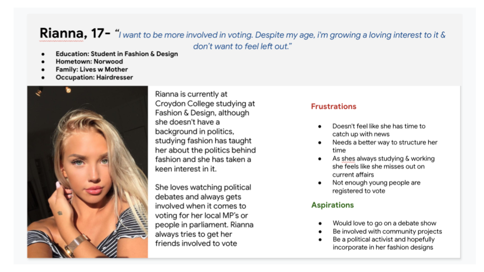
Rianna is a student, who needs An easy to use service so that she can register to vote for the first time because She wants to be more involved in politics & is completely new to this process and doesn’t want to fill out anything incorrectly.
User journey maps
Sitemap
Difficulty with website navigation was a primary pain point for users, so I used that knowledge to create a sitemap. My goal here was to make it really simple. Users complained that most official sites had too many links and that they wanted the navigation to be clear. The pages i created for the site map is very straight to the point having a link to 1 page eliminates any confusion the users may experience
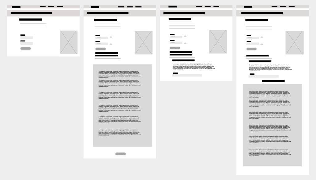
Paper wireframes
Next, I sketched out paper wireframes for each screen in my app, keeping the user pain points about simplicity and not too many jargon in mind. I wanted the screens to feel easy to navigate and use, without causing too much confusion.
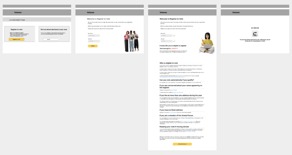
Digital wireframes
Moving from paper to digital wireframes made it easy to understand how the redesign could help address user pain points and improve the user experience. Prioritising useful button locations and visual element placement on the home page was a key part of my strategy.
I then played around with the structure a bit more to see how it would look like with actual imagery. Once i added those in i was able to get a better ideas of how the page might look. The design still came across very formal, i originally wanted to add real people for the imagery but i opted for 3d animation. To possibly make the design feel more appeal to more target users
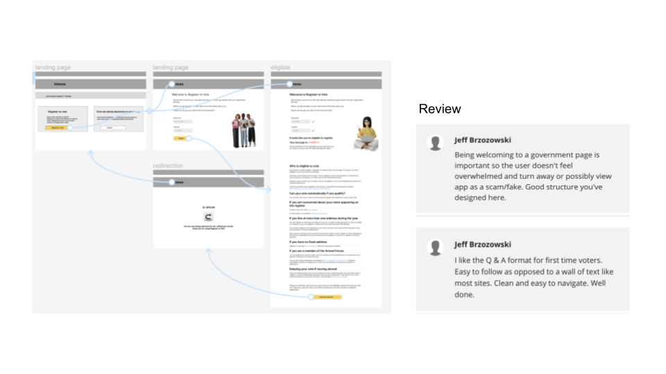
Low fidelity prototype
As my first call of priority was the desktop version, i really wanted to concentrate and focus on not making users feel overwhelmed by the whole experience. Simplicity was the key and getting the hierarchy was important in getting users to follow the design of the page without having to do a lot of scanning.
I knew in the long run, so much more needed to be done to the body of the design, however, prioritising what was needed for the page was at the top of the list. Whilst everything else would fall into place once i conducted a few research studies and got the feedback i needed from the reviews. I welcomed feedback and appreciated all the reviews that was given to me. One stood out to me the most, which helped significantly, in knowing i was making the right design choices. In all honesty, as i wasn’t too sure i was making it clear that “Votemein.” was a 3rd party site, so the feedback provided was very helpful in knowing i was moving in the right direction.
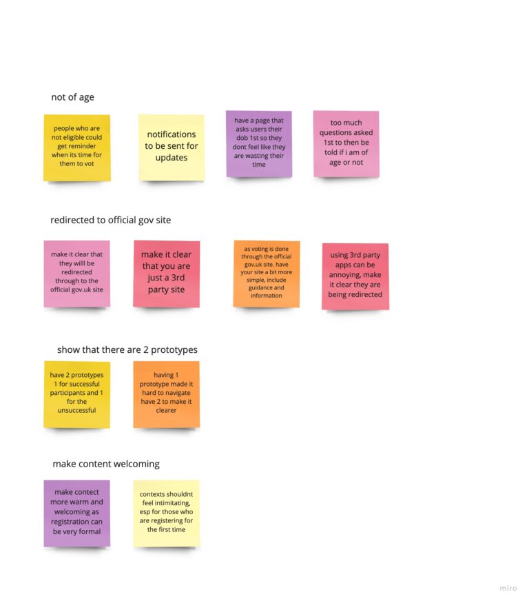
Grouping all the feedback from the usability study
After the unmoderated usability study was conducted, i collected all the reviews and pain points that our test users found and grouped them together. There was quite a lot of feedback to sieve through, so i made sure i took all the relevant and important feedback, that i found was useful to the product.
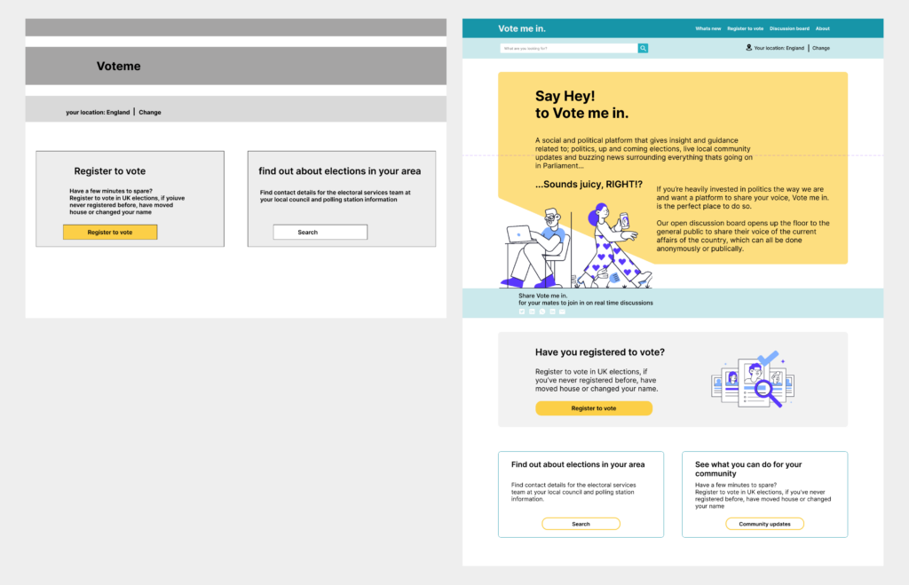
Based on the insights from the usability study, I made changes to improve the site’s landing page. Most users said the original design lacked a welcome element to it and that it still felt felt like a generic government page which turned them off. After the feedback i decided to go for colours ie. blues, that still related back to government bodies attire, however adding softer shades of greys and yellow made it feel less intimidating, as well as adding in friendlier imagery. I also changed the tone of the content that would make it more appealing to users.
Changes to the mockups
The landing page -
Based on the insights from the usability study, I made changes to improve the site’s landing page. I considered the feedback from the usability study, where most users said the original design lacked a welcome element to it and that it still felt like a generic government page which turned them off. When it was time to get round to doing the high fidelity designs i made sure to focus on the warmth and welcoming aspect users felt when landing on the home page.
As i had previously worked in a government space for many years, i knew which primary colours needed to be used first. Government sites usually opt for the colour blue, as it resonates with trust. So, sticking to the theme of that i decided to go for colours ie. blues, that still related back to government bodies attire, however adding softer shades of greys and yellow made it feel less intimidating. I found friendlier imagery that also complemented the style and look that i was aiming for. Changes to the tone of the content, was tweaked making it more appealing to users and speaking a “language” that felt like it could be spoken to of all ages.
Concern with users
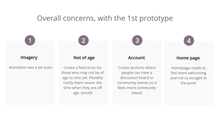
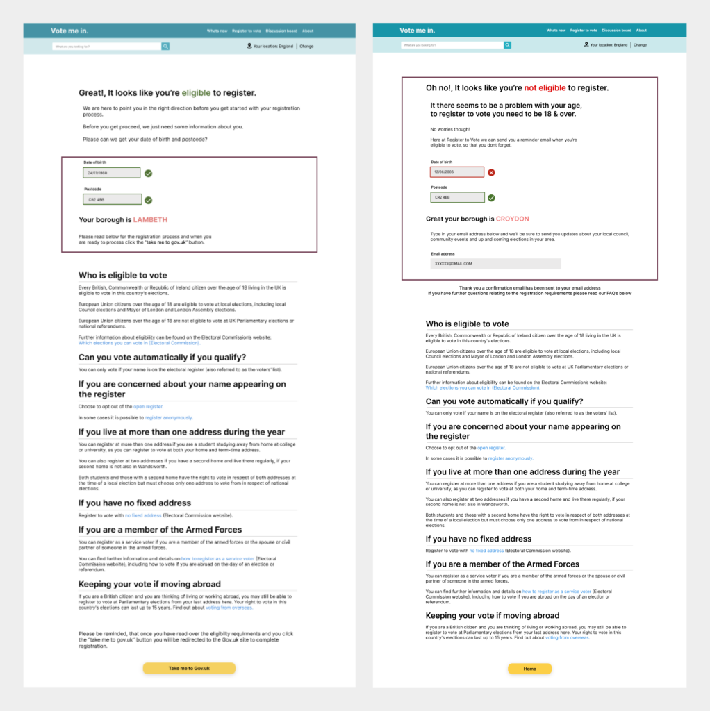
During the study, there was high concerns for users, who wanted to vote, but they were not of age yet. The feedback that came back was that, there should be a clear page of indication that allowed users who were under the age of 18, to be notified at a later date, so that they could vote.
I thought of a simple, yet effective design that didn’t over shadow the aesthetic of the design. A prompt, that was ask users to type in their email address, where they would be able to keep up to to date with; community updates, local news, upcoming elections AND most importantly be notified a month after their 18th birthday ( as the users has previously shared their Date of Birth), we found would be a great idea to alleviate the hassle of the user remembering for themself, this would be useful for future email lists.
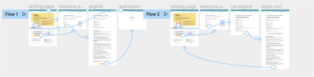
The high fidelity prototype
Showing the 2 flows: For both eligible and non eligible users
Official changes where made to the mockups and a presentation was brought to the team and stakeholders, to get their point of view on the overall design and feel of the site. We ticked off the concerns fro the usability study and made sure that these were no longer an issue on the site.
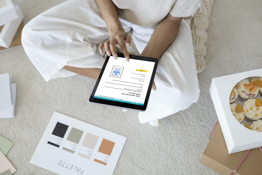
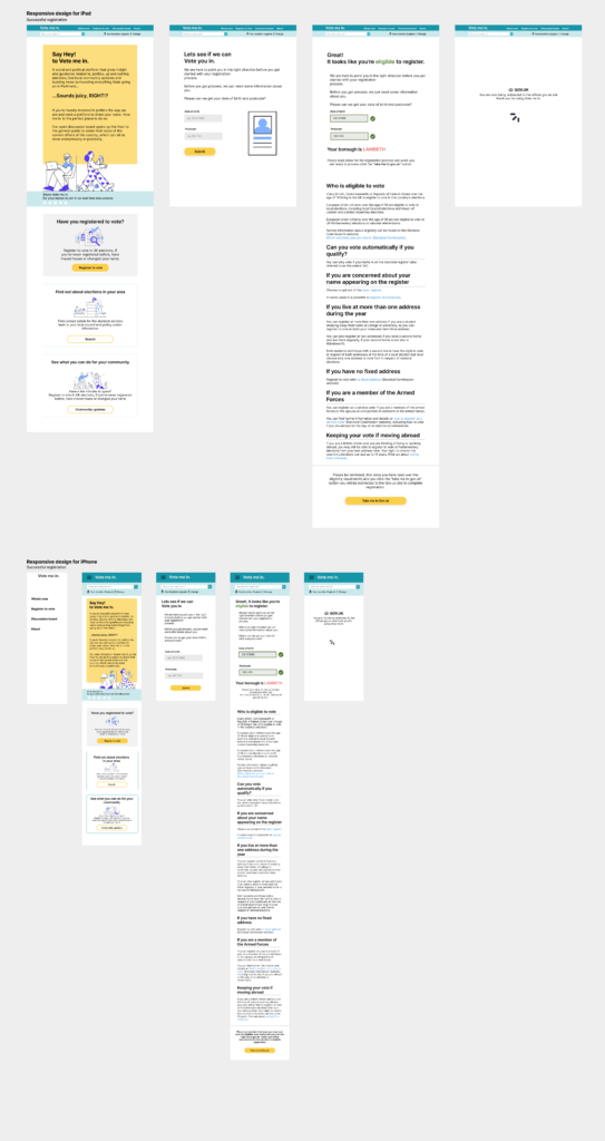
Responsive designs for Tablets & Smartphones
Users who are eligible
Users who aren't eligible
I had to ensure that my designs could be used across different screen sizes, this was another vital element in the design process. I didn’t want to assume that users would soley being using the “Votemein.” on a desktop. As we know, people are always on the move and having the accessibility, for the design to be responsive enough to be used across different devices makes things a lot more easier for our users.
The use of white space and sizing, i found to be a bit of a challenge, especially when it came to the “Home” page. As the desktop site had the big animation and a lot on information on one page. Once i got my head around using the space effectively and balancing out the sizing, i finally got round to designing the responsive pages where they still looked similar without losing so much of the actual design.
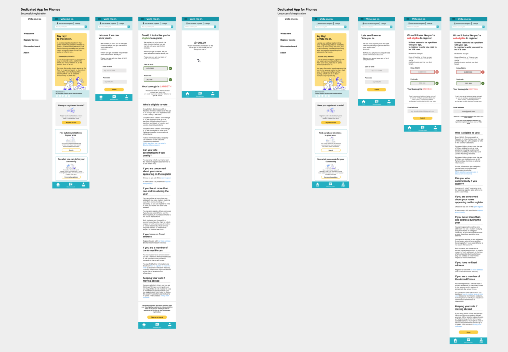
Dedicated App for Smartphones
The dedicated mobile app, had the same design as the responsive website. I included icons and label each clearly for users who may not know what the icon would mean on its own.
As “Votemein.” is more of an information based platform, where users can find latest updates, as well as interact with other users through there discussion board, i wanted the navigation to not be cluttered with unnecessary information, that wasn’t relevant to the platform or the users.
Users could easily:
1) click the “Home button” which would essentially take them back to the start.
2) navigate directly to the “Discussion board”, which was intentionally placed at the bottom middle, so that users would naturally want to use the the button to interact with other users
3)Create a user profile
Going forward
Impact: Our target users shared that the design was intuitive to navigate through, more engaging with the images, and demonstrated a clear visual hierarchy.
What I learned: I learned that even a small design change can have a huge impact on the user experience. The most important takeaway for me is to always focus on the real needs of the user when coming up with design ideas and solutions.
Next steps: Conduct follow-up usability testing on the new website and the app and identify any additional areas of need and ideate on new features, create the other pages, that haven’t been tested out as yet, like the; bottom navigation icons, search page, location settings and the rest of the links in the fly out menu.